Gupshup design system Built for scalability, flexibility, and accessibility at its core. It ensures a unified look across all platforms, enhances product experiences with reusable components and clear guidelines.

Establishing a framework for infrastructure that fosters scalable alignment between brand & product.
As Gupshup experienced rapid growth, significant design debt accumulated within the product. One of the key challenges we faced was the lack of UI and UX consistency across various pages, products, features, and components. This inconsistency arose because different parts of the product were designed at different times by different designers, each operating within their own unique context and without a unifying design philosophy or guiding principles.
Over time, this fragmentation made our products feel like separate applications across different platforms. The issue became even more pronounced when designing new pages, products, or features. The absence of well-defined design principles not only led to inefficiencies in decision-making and implementation but also negatively impacted the user experience by reducing predictability and consistency.
As the Senior Product Designer at Gupshup Inc., I was responsible for ensuring that our design system enabled teams to collaborate efficiently and accelerate their workflows. Upon joining, I inherited an overbuilt yet under-documented Figma file that lacked proper alignment with the front-end system. By the time I left, I had established comprehensive documentation, introduced a structured practice of critique and governance to continuously refine the design system, and initiated a collaborative process with engineering. This helped position the design system as a shared priority between design and engineering, fostering greater alignment and efficiency.
Impact
I immediately saw an increase in cohesion and decrease in rogue components, and a faster pace of iterative and early design work. The governance process I established created more opportunities for designers to work together, getting early visibility into how the system was emerging across the products. This visibility expanded as we hired a dedicated front end engineer and started to pull the visual system into code.

70%
25%
80%
While diverse profit product groups pursued their unique objectives, our product encounters became disjointed due to disparate executions.

This created fractures in how the brand was perceived by a customer, and even how internal teams reused common elements. At an organizational level, each piece of the flow was built by different teams, which created discrepancies in the execution.


How can the product team develop a scalable Design system that enables users to establish consistent connections within our brand?
This created fractures in how the brand was perceived by a customer, and even how internal teams reused common elements. At an organizational level, each piece of the flow was built by different teams, which created discrepancies in the execution.
To better understand the needs and challenges of design system users, I spoke with stakeholders from product management, engineering, data science, customer experience, and marketing. These discussions gave me valuable insights into the team's struggles and helped identify areas for improving the design system.
Understanding the primary users
Product Managers
Spending too much time in granular and nitpick decisions
Wasting time and energy in using multiple tools to communicate
Slow decision making (bad business)
Product Designers
Missing components, states, colors, etc.
Unreliable document management and organization of the UI kit
Clunky and slow prototyping
Engineering collaboration could improve
Front-end Engineers
Differences in code, designs, and requirements
Blocked by design decisions; uncertainty in making design decisions
Lack of consistency
Design collaboration could improve
Moving ahead with Workshop
I facilitated a global workshop with cross-functional partners to identify inconsistencies in our brand and componentry, prioritize focus for an MVP, and create a shared perspective around brand elements in product.

Key Takeaways
Lack of clear design guidelines, leading to inconsistencies in Ul and UX
Missing components, states, and colors in the design system
Inefficient document management and organization of the Ul kit
Difficulties in cross-functional collaboration and communication
Slow decision-making processes and product development
As the Senior Product Designer, I collaborated with cross-functional teams to conduct a comprehensive design system audit and advocate for the Design system adoption & maintenance.
As the Senior Product Designer, balancing design system development alongside fast-paced UX work was a challenge. The system needed to scale rapidly as new use cases emerged, requiring a strategic approach to expansion and refinement.
Partnering with the Head of Product and Front-End Engineers, I defined a phase by phase priorities, emphasizing rapid scalability and modularity. Given tight MVP launch deadlines, I prioritized reusable components and a templated layout approach to ensure efficiency and consistency.


Based on Scope and Consideration, we decided to evolve the existing design system by completing an audit, migrating the UI kit to Figma, and creating design guidelines for UX patterns. The team agreed to prioritize the project only after all other product work was completed.
As the Senior Product Designer, I collaborated with cross-functional teams to conduct a comprehensive design system audit and advocate for the Design system adoption & maintenance.
I proceeded to set up the foundations with a series of page templates. Following the UX best practices, I explored a few approaches to information architecture, navigation and sidebar options. Working with the front-end engineers, we defined the grid for key breakpoints

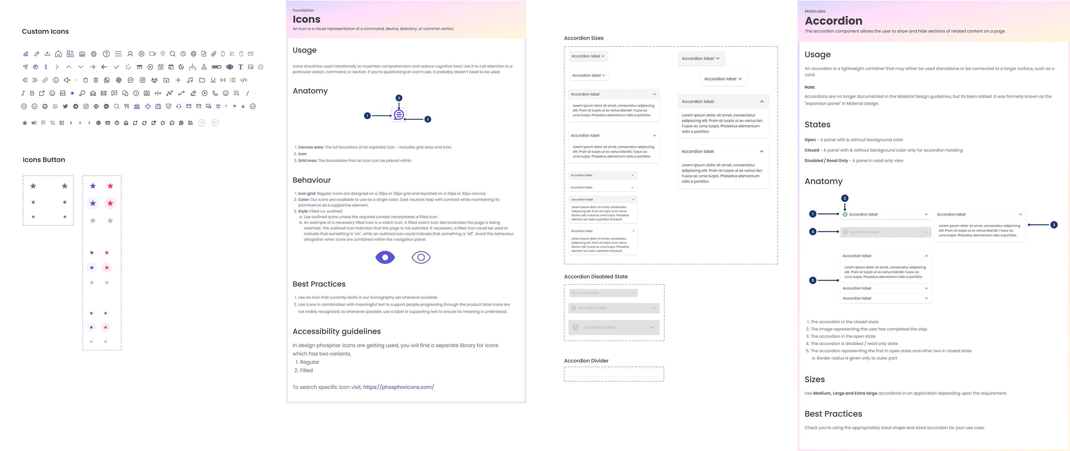
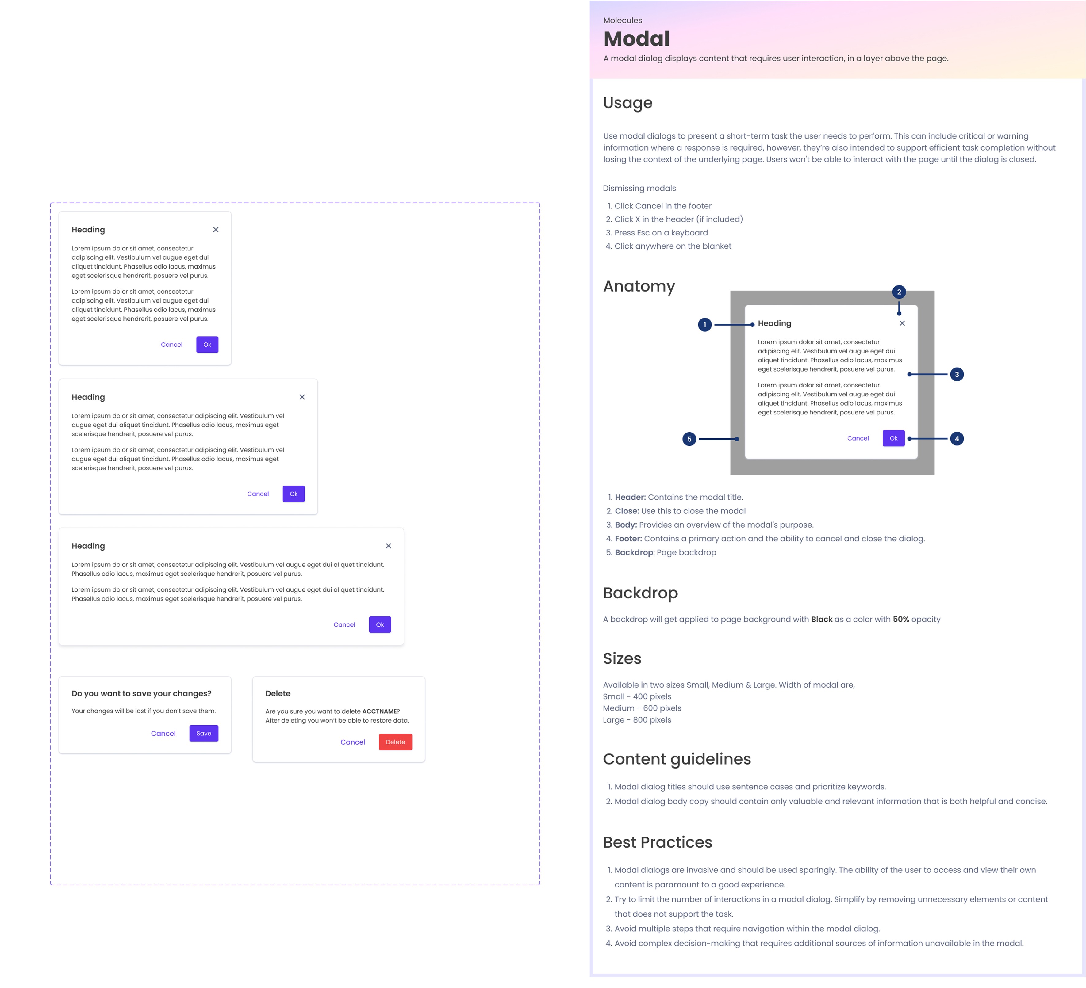
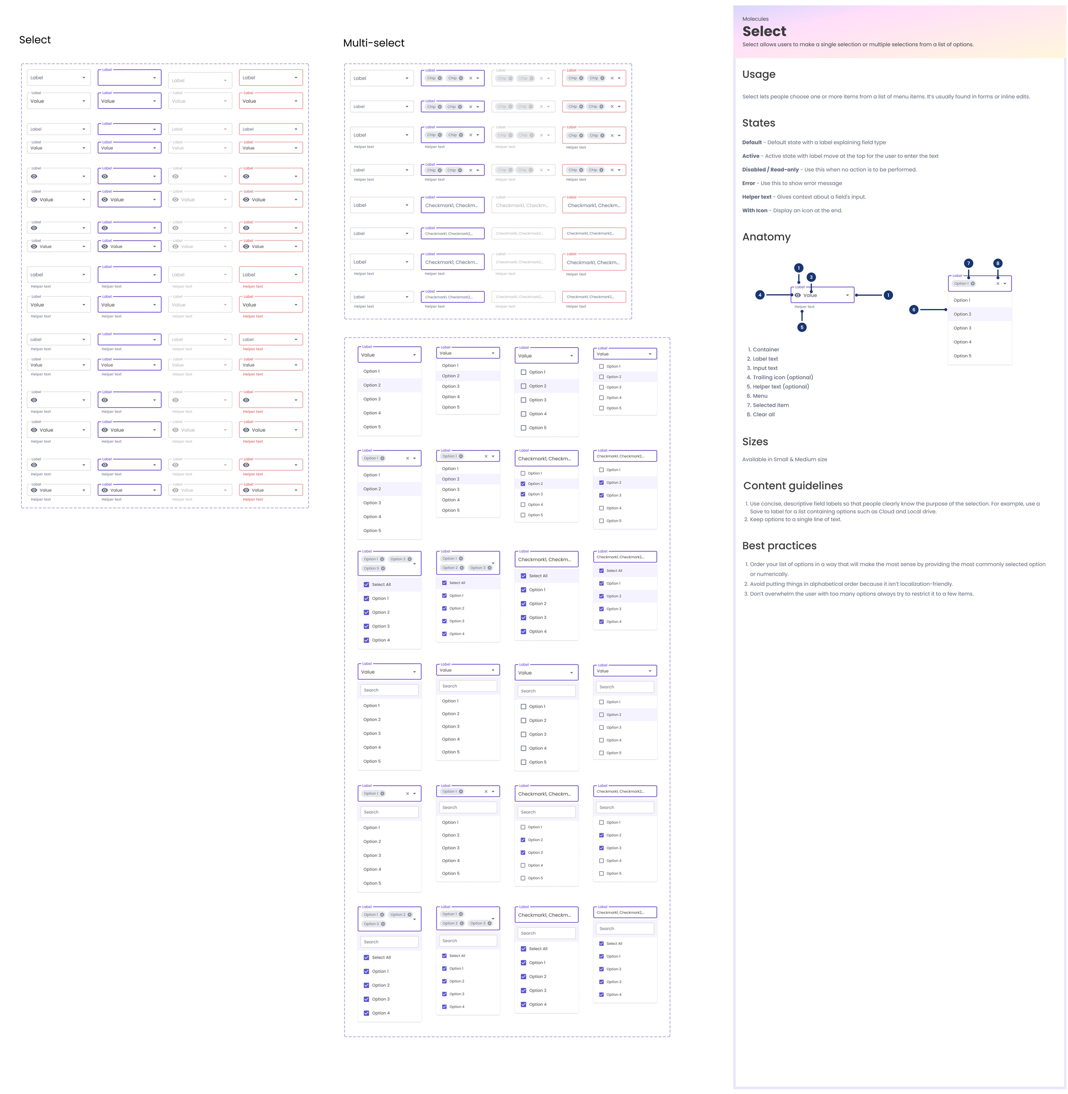
The next step was getting started on an ever-developing set of components, guided by the Atomic Design approach. Continuously working with developers, we made sure that naming conventions and component organisation work for both sides.

Based on analysis and research, we decided to evolve the existing design system by completing an audit, migrating the UI kit to Figma, and creating design guidelines for UX patterns. The team agreed to prioritise the project only after all other product work was completed.
Process
The process of evolving Gupshup design system involved the following steps:
1. Conducting an audit of the design system, the live products, tooling, and documentation
2. Migrating and implementing the new design system UI kit
3. Conducting presentations and training sessions for the design and development teams
4. Creating guidelines of the most common UX design patterns
5. Collaborating with engineering to create a back-log and roadmap
I proceeded to set up the foundations with a series of page templates. Following the UX best practices, I explored a few approaches to information architecture, navigation and sidebar options. Working with the front-end engineers, we defined the grid for key breakpoints


Accessibility baked into the process
Having the opportunity to build a Design System from scratch meant that accessibility became part of the process, rather than an afterthought.
Some of the key principles taken into account were:
Checking colour contrast on different background and across different interaction states (this included me going down a deep rabbit hole of accessibility standards for disabled buttons)
Ensuring font size + touch targets on mobile are appropriate
Including text labels with icons on mobile navigation
Consistency across layouts and similar UI elements
There is definitely room for improvements, as trade offs have to be made and time to ensure all standards are met is limited, but it sets us up on the right path and ensures that adherence to accessibility standards is a shared mission.
By establishing a common design perspective, we strengthened the connection between the brand vision and the product's technical feasibility.
The updated design system had a positive impact on cross-functional collaboration by allowing for smoother communication between the design and development teams and reducing time spent on design-related discussions. Design efficiency improved as the design process became more streamlined, leading to faster product development and reduced time to market. Decision-making was also impacted positively, as the updated design system provided a clear direction for the design team and allowed for quicker and more informed decision-making. The Design System played a key role in ensuring a successful launch:
It provided a cohesive look and feel for the rebrand
It gave me a structure and a set of principles to return to when making decisions on sometimes conflicting requests from the wider team
It streamlined the design process, which was key for a Product designer
It led to a faster design to market time, providing developers with a single source of truth and a set of reusable components and patterns


Creating an inclusive working environment helped reinforce the paradigm shift for the future of Design Systems at Spotify.
Since cross-functional teams were involved from the beginning, they were invested in the shared outcome from this vision. The Dev team leveraged the consolidated visual foundation to run a baseline test. There was an increase in User Signups, successful Journey buildings and a significant increase in product usage. Additionally, the team also constructed reusable Components in React, moving away from Bootstrap, to help create a tighter relationship between our Home and Premium pages. This reduced the product cost to test new plan formats. A community ensures that teams are bought in under a shared point of view. This creates leverage for more efficient change that is rooted in concrete brand foundations. This vision was used to influence and formalize a team within Central Design to focus on centralizing and distributing Design Systems at Spotify.
It provided a cohesive look and feel for the rebrand
It gave me a structure and a set of principles to return to when making decisions on sometimes conflicting requests from the wider team
It streamlined the design process, which was key for a Product designer
It led to a faster design to market time, providing developers with a single source of truth and a set of reusable components and patterns


My Clients & Colleagues say


While most of my client reviews are NDA-protected, I managed to sneak in a few favorites from my previous Managers & Co-workers.